Showing posts with label runway review. Show all posts

Thursday, September 19, 2013

nicole miller SS14 | versailles rebel.

From dainty to daring and flapper to fantabulous, elegant and exuberant and sultry to shimmering, I'm tempted to write a 5th grade style acrostic poem as an attempt to list all the relevant adjectives that sum up one of the best, most wearable collections I have seen in a long time. Nicole Miller mightn't be a household name, but I know I'm not the only one completely enchanted by her cohesive collection of some of Spring's most timeless themes. While Miranda Priestley is (in)famous for sarcastically commenting on the groundbreaking nature of florals for spring, I'm far too taken with Miller's futuristic interpretations of fashion's most beloved "S/S" motifs to care about recycling trends that I actually really love. So what if designers do stripes and florals every Spring Summer season? There's a reason for such fond favorites to continuously reoccur - because we love them very very much. After all, the best way to reinvent your style for SS14 is to do it the Nicole Miller way: wear stripes, florals and tons of summery color all in one explosive, seamless ensemble. Here's to revisiting and reinventing favorites!

Some of the most stellar pieces in the collection made use of a simple black and white palette, spotlighting the intricate detail and workmanship of the pieces by toning down color. Geometry reigns supreme with a modern, glamorously fitted top and a pencil skirt with inverted color placement (centre left) - perfect for creating a sleek silhouette on any shape or size. A black leather crop is balanced out neatly with a flowy white knee-length skirt; another universally sensuous match made in monochrome heaven. Speaking of contrast, few things are more strikingly delicate than the white sheath skirt in the centre right image - statement making with a graceful, feminine touch has never been easier.

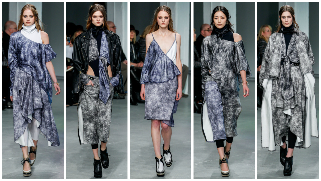
Deeper than turquoise, bluer than aqua yet still oddly green… I have no idea what that captivating color is but it's delicious and seems rather fit for the season. It's fresh but not adolescent, sophisticated minus the stiffness. It's an organic cross between stained-glass and the interior of a kaleidoscope, and the flecks of magenta and sky blue make this print utterly magnificent and easily translated onto a number of ensembles. I'm loving the shapely punctuation offered by the thick black panel stitching in the two dresses on the right; I wouldn't mind a strapless minidress in that print! While I'm not as much of a fan of the seemingly magnified print as seen on the top on the far left and skirt on the centre left, I'm so head over heels with that deep, luscious color that it hardly bothers me at all.

And now onto the outerwear, possibly the hardest aspect of a collection for designers to strike a balance between artistic, statement-making and wearable. Nicole Miller seems to have no issues with making her designs down-to-earth enough to be worn by actual human women (let's hope her price tags echo that strength!), and these jackets are testament to her "wearability is key" philosophy (she didn't actually say that quote, I just decided three seconds ago that her brand's philosophy should be wearability yep). A bit punk, a lot embellished, but slightly verging on too topshoppy, these are very cute. Very cute indeed.

True glamour always contains a concealed edge, and in Miller's world, this takes the form of beautiful stained-glass shards positioned in an angular, geometric explosion on various tops, skirts and dresses. Pristinely defined, perfectly contemporary and another universally flattering success, these ensembles help jagged color and classic silhouettes balance out beautifully. I'm totally in favor of the sporty, cut-in necklines (far right) and casual, cropped lengths which show a hint of midriff. If these pieces can't be worn to the office, out at night, to fashion week or anything in between, then what can?

 Fashionista.com describes this collection as being inspired by "the aftermath of a gang of rebel girls storming the castle," and it couldn't have been better put. This gloriously colorful, decadent juxtaposition of grunge-chic rebels and elegant femininity culminate dramatically in the seven looks above. By infusing bold monochrome stripes with watercolor florals, throwing a raw white leather vest over a fitted power dress and punctuating a striped pencil skirt with bursts of blooms, the result is no less than pinstripe perfection with a springtime-appropriate dose of bright florals. Top marks for reinvention, wearability and sex appeal.

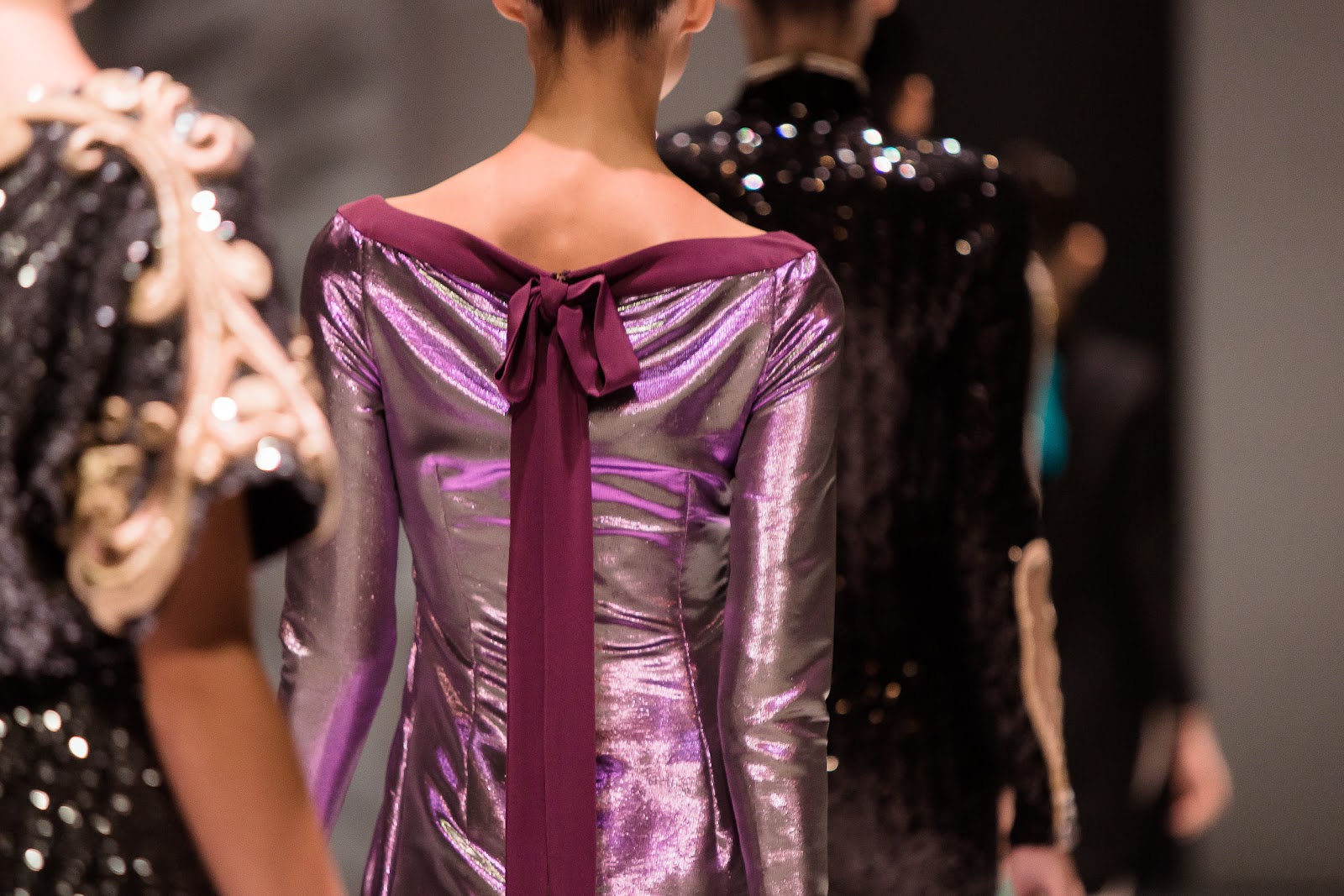
 Towards the end of the show, a shift in focus to a less "teenage rebel" and more "refined princess" look can be noted through the evolution of colorful florals to gold baroque embellishments and modern white base hues to sheer pearl ones. Black becomes increasingly dominant as necklines reach a sexy, all time low in deep Vs decorated with ornate gold detailing. Tasseled jewelry becomes a permanent fixture, adding an ornate finish to pared-down, floor sweeping gowns with a sexy, linear finish. Nicole Miller's astounding ability to manipulate simple lines of color and fabric to construct the aesthetic framework of her pieces continues to boast success throughout the collection, adding dimension and shape to her expertly crafted pieces. Sequined floral motifs epically clash with baby pink twirly skirts, decadent glimmering accents glint with movement and bold, cloudy prints add lustrous mystique. Perfection.


So, what do you think of Nicole Miller's gorgeous Spring/Summer 2014 collection?

Saturday, July 6, 2013

fall '13 couture hits & misses: dior.

I can blame being busy/exams/everything else on my embarassing lack of attention and focus on all the collections this past... year (head hangs in shame), but there's really no excuse for missing out on the shining highlights of the industry that grace us annually on numerous occasions and in numerous ways. My favorite of these has always been Cruise/Resort, which is even lighter and brighter than Spring/Summer collections and have an amazing flavor of wearability and reality to them. On the entirely opposite side we have Couture; where designers roll up their sleeves and churn out multi-million dollar collections with designs so elaborate they occasionally become nonsensical and excessively theatrical. I sometimes get the feeling that these costumes of simultaneous sophistication and hilarity are unconditionally accepted and celebrated throughout the industry with a sort of deep-rooted respect justified only by the heavy price tag and the glowing embroidered word that we all covet and crave: Couture. Thoughts?

Enough said - let's take Dior's Fall 2013 Couture collection and break it down to what it really is. Here are, in my opinion, the hits and misses of Raf Simons' third shot at couture for the house of Christian Dior.

 Hits:
Vogue UK describes this collection as one that is "moving away from the idea of this being just a quintessentially French brand," in other words, carefully melting, moulding and reshaping public perception of the stiff, European design house. This generic objective of modernization as a result of globalization could be applied to almost every archaic design house to a certain extent, and because of that, one could easily foresee the aforementioned shift as one with disastrous artistic consequences - resulting in identical collections being churned out from every designer keen to explore something unusual along the lines of African tribes, rural Asian religious influences... and not much else. I held my breath scrolling through the photographs available online, and was very much relieved to see that while Raf Simons' assumed inspiration for this collection was relatively generic, his designs proved to be ingeniously unique, distinct and unlike any collection I've seen before.
From the tight fitted, geometric explosion on the far left to the daringly revealing ensemble on the far right, Simons' utilized a myriad of textures, fabrics and colors, and while skilfully manipulating the opacity of the pieces, fused unexpected combinations together to form quirky, light-hearted ensembles that definitely made me smile. The sleek, futuristic dress on the far left with unique shoulder detailing and the most elegant silhouette ever is a huge winner in my book. Second from the left is a disheveled ensemble that is instantly pulled together by the overruling presence of white (Simons has clearly taken a peek in Rumi's wardrobe), and in the centre is an architectural masterpiece of a button-down gone wrong - something more of a button-side, button-sleeve and button-hem, really! Second from the right is a stacked sorbet-hued confection that looks good enough to eat, and the voluminous pleated cream skirt provides almost enough distraction from an oddly risque bodice.

Another great aspect of Dior's Fall/Winter 2013 Couture presentation was the prominent use and endless reinvention of a classic: tailoring. From double-breasted blazers to belted trench coats to dresses topped with narrow lapels, the art of simple folds and buttons to punctuate fabric was manipulated to great acclaim. I particularly enjoyed the ensemble in the centre; the sexy cut-out, the simple belt and the presence of those gorgeous leather gloves combine to give conservative office-wear an unexpected update a la Simons. 

Oh, the humble drop waist! (Or in this case, the many ways of conjuring waistline illusions.) The fire-engine red dress second from the right looks a bit like peplum, except it feels more like an upside-down wilted poppy in the most beautiful way possible. I would've loved to see the dynamics of that dress in motion at the show, but style.com lets you watch the look being modeled live so that'll have to do for now. Whether obvious like the billowy white dress belted twice on the far left, or a little more subtle like the seemingly spherical waist of the ensemble on the far right, waistline manipulation usually introduces androgyny, but in this case it seems to merely offer fresh, transformed ideas of classic beauty, veering away from the conventional.

While Couture is indirectly celebrated as artistry which occasionally eludes practicality and wearability (take McQueen's works of art, for instance: beautiful but almost impossible to wear on a daily basis), in my opinion, it's important for a collection to also explore simpler, more wearable pieces. I love seeing celebrities' fashion choices for major international events, many of them opting for pieces from Couture collections, so for a collection to be successful not only in the face of the fashion industry but in a more widespread, public context intertwined with the entertainment industry, wearable pieces are key. Most of the pieces I've selected as "hits" are the simpler pieces in the collection, which successfully retain the rich inspiration this collection derives from without overdoing silhouettes, fabrics or contrast. I would absolutely love to see Kelly Rowland working that blue ensemble (centre) on the red carpet, and the dress second from the right looks like it was made for Tilda Swinton.

As I mentioned above, every successful collection needs a couple of truly universal pieces - the traditional long dresses that flatter the woman's form and leave behind any crazy ideas of shapelessness, androgyny or wild theatrical ideas that the designer might have had, and might have executed in the remainder of his collection. Don't get me wrong: I thoroughly enjoyed the more unconventional pieces that Dior had to offer, but in terms of celebrities and wearability, it's rare to see a wildly unconventional ensemble from a Couture collection donned on the red carpet. The five dresses above may be simple in appearance, but each possess subtle characteristics that reflect, albeit less boldly, the many themes of Simons' vision. From the delicate origami cream dress on the far right to the red dress with a sexy overlay (someone call Taylor Swift and make her wear that please), these masterpieces retain the character and life of the collection without going over the top.

Misses:
In every collection, there are always those pieces that just make you think "...Seriously? Come on!" The six images above should serve to explain my first issue with this collection; the fact that the "laid back" attitude reflected in the styling and silhouettes of these pieces went terribly, embarassingly wrong. I don't see how the puffy sleeved blue Teletubbies-esque piece or its grey cropped counterpart can look flattering on anyone. Ever. The awkwardly shaped outer layer over the halloween-striped dress doesn't do anything for me, and neither do the clashing stripes in the ensemble second from the right. Facepalming eternally.


For someone who proved immensely capable of flattering the female form through other pieces in his collection, these pieces are a shock to the system. I can see the creative potential trying to wriggle out into the limelight but failing to get past the swathes of unnecessary, badly-constructed pieces of fabric. This is not modern-cool statement tailoring, this is frumpy and ugly. Sorry not sorry.

 These were pieces that were on the fence for me - I wasn't quite sure if they were total "misses," but they certainly weren't "hits." While debating over whether or not to add a "meh" section between the extremes of "hit" or "miss," I realized the thing all these pieces have in common: they're simply overdone. Many of these pieces have very similar partner pieces in the collection, but these have just been taken two steps TOO far. The piece on the far left had a sexy, futuristic version (which I placed in the "hits" section), but this one looks like an unflattering, messy space suit gone very wrong. The piece second from the left was beautiful in monochrome version (also in the "hits" section), but the blegh print is just too much. The ensemble on the far right looked beautiful in full-length version, but unflatteringly cropped and watermelon-esque in the image above.


These pieces could've been successful if a better fabric was used - the velvety sheen cheapens the entire look of these three outfits.

 These pieces I have no hope for - they're simply worlds away from anything that is sartorially acceptable in my mind and are, quite frankly, beyond repair. Nudity is sexy in small, subtle doses, Raf. And no one would wear that red curtain over their shoulders in public - ever. 

Total thumbs up for the beauty aspect of the show though - the smouldering eyes were gorgeously understated using only bright, metallic accents, and luscious lips were achieved with a beautiful coat that combined rich color and statement shine. I definitely thought Dior's makeup look was pulled off better by the models of colour, though; in my opinion, the brown, copper and gold tones complement darker skin much more than fair skin. 

What did you guys think of Dior's Fall 2013 Couture collection?

Sunday, March 10, 2013

nyfw fall 2013 rtw | rodarte.

 During this digital age of lightning speed, contemporary design techniques and an ever-present futuristic focus, a funky dose of DIY is always thoroughly appreciated and welcomed with open arms. Season after season, the Mulleavy sisters have continued to impress, enthrall and excite the fashion world with their effortless skill and other-wordly design aesthetic. Drawing inspiration from their childhood home of Santa Cruz, the collection features more of an interpreted insight into their memories as opposed to a literal derivation of Santa Cruz style. As said by Nicole Phelps, "the clothes are more a product of the Mulleavys' imaginations and their fond memories of their younger days than anything you'll see walking around the California beach town."

 Believe me, I tried, and it was really really hard to spot a flaw in this collection. It set the tone and nailed the expectations of what every fall/winter ready-to-wear presentation should include. There was an appropriate sense of sophistication woven through the show from start to finish; even the blooming ruffles and cream-colored satin felt more 'grunge-princess' than 'innocent flower child' (a la spring/summer). In true DIY style there was a wonderful excess of fabric in many of the looks, yet not a single ensemble struck me as overdone, crowded or "drowning" the model in unnecessary swathes of cloth. As shown in the extreme left image above, more voluminous pieces were cleverly balanced out by mannish, curt accents such as blazers and tailored shoulders. The clean duochrome footwear probably marked the peak of modernity in this show, but managed to successfully blend in thanks to the inclusion of the cutest floral-patterned ankle socks ever. 

 As the collection progressed, experimentation with color and contrast took flight in the form of these showstopping gowns ("kaleidoscope" doesn't sound like such a hyperbole anymore!). It's more than just a 'slight risk' when you implement primary colors, awkward nude leggings and a medley of gemstones onto a native-looking smock top (second from right), and it's no easy feat to stick a tailored "cap" on a flowy gown either (second from left), but Rodarte has clearly done some successful risk-evaluation and nailed both uncanny looks. My favorite has to be the translucent floral sheath pictured in the extreme-left and the centre look - what a great way to add a dash of seductiveness! Also, tie-dye has never looked this hot.

 Mottled? Dappled? Stone-washed? An artistic interpretation of a cloudy day? I'm not too sure how to accurately address this print, but I'm in love with it. It's stunning versatility and high "style success rate" is encompassed in the pictures above - be it flowy skirts, sensual knotted dresses or v-neck frocks, I want me some mysterious cloud-printed ANYTHING in my wardrobe, pronto.
 
 Black has to be the Mulleavy sisters' go-to color, because it embodies and enhances everything the brand stands for: versatility, theatrics, artistic clothing and stylistic techniques. Sure enough, the sisters did this season's black with their usual effortlessness. Sexy black leotards, plenty of slouch, heavy leathery fabrics and cloaks makes "black on black on black on black" endlessly appealing The metallic accessories were amongst the few aspects of this collection that were placed with the intention to match and blend in.

Rodarte has always struck me as a beautiful explosion of intertwined cultural references, unexpected combinations and ornate expressions of a truly artistic vision.
 
What did you think of Rodarte's Fall 2013 RTW collection?

Friday, January 18, 2013

pre-fall 2013 | carven.

The rancid, delirium-inducing burden of exams has finally been lifted (for now), and I can't tell you how happy I am to be able to drift aimlessly from blog to blog and catch up on all that I've missed - namely this monstrosity of a success that is Carven Pre-Fall 2013. 
Firstly, I've always kind of had a crush on the whole concept of Pre-Fall. While it can be perceived as an aspirational attempt by the modern fashion industry to suck even more money out of consumers' pockets in the form of a 'not-really-season' sandwiched between S/S and F/W, I actually think it's a beautiful concept that is somewhat relieved of the impending expectations that Spring/Summer and Fall/Winter collections find themselves buried under year after year. Everyone is now so accustomed to holding their breath during the two main seasons because we all expect to be absolutely blown away; I don't know about you, but I certainly didn't see the whole "let's put a train on the runway" thing coming (cough Marc Jacobs). Not that that's a bad thing of course - we all like to be surprised and thrilled during fashion week, but sometimes I think the large-scale theatrics and superfluous stunts can end up taking away from the fashion itself. It suddenly becomes a question of "what crazy shit can we do on the runway THIS time round?" as opposed to "what kind of aesthetic, era, emotion or concept can we evoke and be inspired by this season?"
And that's why I love Pre-Fall. There are no loco expectations of trains and oversized crystals adorning the runways; heck, it's not a competition of which fashion house can drive an A380 down their runway first - it's just about the clothes. Pre-Fall collections are smaller and much more focused, with a refined aesthetic and an almost nonchalant vibe, in the case of most of the collections I've browsed. They tend to have a ready-to-wear flair to them which I absolutely adore, because that way, the clothes are automatically brought one step closer to you.
 Okay - onto Carven.
 I don't know how a collection can embody youthful sportiness and elegant sophistication at the same time while exuding silhouettes from both the past and the present, but Guillaume Henry clearly has that downpacked. The eccentric, well-selected colors have an ornate, historical feel to them - terracotta parkas, muted blue lace sheaths, speckled vermillion trenchcoats and prussian-blue everything is evidently all that's needed to make for an absolutely dashing Pre-Fall collection. It's all very young and nonchalant, yet it's clothing that seems self-assured of its sophistication. The smooth leather separates were a refreshing reincarnation of the raging trend which dominated the runways over the last few years, and it reminded me why equestrian-inspired clothing has such a universal appeal. There's a great emphasis on visually manipulating the neck too (a good way to move on from the Fall 2012 shoulder-obsession!), be it with high collars, fur, or simply lots of volume. The verdict? Ah-mazing.
"She likes to collage textures, prints and color," Guillaume Henry says of his muse. Yep, sounds about right.

Vote for this post on Lucky Community here! 

Thursday, December 20, 2012

fide #2 - gustavo lins & alexis mabille.

Gustavo Lins
From elbow length gloves to metallic outerwear; black on black (on black on black on black) to awkward puffy blue fur (sorry Gustavo), this collection was certainly a thought-provoking one with both strong and weak aspects. While I most certainly enjoyed the fabric choices, I felt that there was a lack of "wow-factor," despite significant technical proficiency on the designer's part. The color scheme was a little confusing (lime green to gold to black, and then every color in between?), but it was clean-cut and well put-together nonetheless. Favorites have to be the assymmetrical neckline dresses pictured with gloves, as well as all the black ensembles - call me a sucker for black, but seriously, those pieces were SO well done.

Black is one of the most challenging colors to work with, simply because it leaves such a huge margin for criticism. It's a color that can be outstandingly effective when utilized in appropriate doses, but when a couturier starts OD'ing on it, critics go wild with insults. I have something of a sympathy when it comes to black though; I think it's an elegant understatement which can be emphasized or amplified with the use of things like metallic accents and tailoring, both of which Gustavo has fulfilled to great excess. There's nothing more chic than a LBD with a gold cuff, so the statement necklaces which punctuate an otherwise "flat" ensemble bring up the "chic" factor by a couple notches. The swishy dress with a daring neckline (second from right) was another simplistic beauty, and the general mash-up of fabrics was executed brilliantly.
To be perfectly honest, the infusion of bright blue fur/terrycloth accents (as pictured above) into an otherwise refined collection was a huge disappointment and deterrent to the success of the runway presentation. I loved everything else Gustavo showed, but this just didn't make the cut. It was far too avant-garde for a subdued, chic collection, and the texture screamed "blanket" more than "haute couture" to me.

I couldn't help myself - I simply had to group these pieces together to achieve a somewhat Christmassy color scheme! Although I don't particularly agree on the erratic black splotches (second to the left), the leather lining (left) looked SO classy, as did the "cut and paste" nature of the dress furthest to the right. I've always been skeptical about dresses made entirely of leather (the only person I know who can always pull off leather is Rumi Neely), but the daring slit and v-neck (second from right) made the dress a no-brainer of a winner. On a side note, how beautiful is the model on the extreme left?! She's such a stunner. 
Probably one of the strongest points of the collection, the seamless intertwining of - yes, male models into the presentation. There's nothing more refreshing than seeing a slick-haired beau march down the catwalk after dozens of gaunt females have strutted their stuff (after a while they all begin to look the same, not gonna lie). Gustavo kept the menswear to a tight-lipped minimum, with lusciously dark hues and masculine proportions. While the shredded leather look (furthest to the right) doesn't quite hit the spot, the slouchy cape look (second to the right) definitely does.

Alexis Mabille
Ornate, embellished and absolutely breathtaking - I don't really know how else to translate the beauty of Mabille's collection into words without sounding like I'm having an affair with one of his dresses. But seriously, this man is an artistic, conceptual genius. There is something so pure about his work, something so cohesive and secure about the way he put this collection together. There's an undoubted sense of flow, yet each magnificent ensemble retains a glittering uniqueness unlike any other piece in the collection. Decorated generously with jewels - be it on headpieces or trimmings, the sheer radiance of the designs set the runway alight with the flame of fantasy as Mabille shared with us his escapades into the realm of the surreal.

Perhaps one of the greatest things about this collection is Mabille's fluency at honing all aspects of the female form. Androgyny has taken the world by storm in the last few years, and it's so rare to see a collection so abundantly filled with girly silhouettes and delicate structural choices. Mabille didn't do anything to dilute his authentic flavor with a dose of masculinity - he chose v-necks over boxy shoulders, and pieces that emphasized the bust and waist in true female fashion. Masculinity has been terribly overused and abused in the female fashion sector, that it came almost as a shock to see clothing that wholeheartedly embraces a woman's form. From sweeping lace to dramatic tails, simply looking at these stunning ensembles makes me feel so in touch with my feminine side. These clothes aren't provocative, edgy or attempting to make some sort of revolutionary statement, yet they still retain a fierce quality worthy of a double-take.


+ All photo-credits to Fide Fashion Weeks.
+ Check out my first Fide Fashion Week post here!
+ [sponsored link] Melrose Medley, your one-stop destination for trendy, stylish apparel! Check out their Facebook, Twitter and Website.


Tuesday, October 23, 2012

future fashion now ss13 | part 2.

{read part 1 here}
From eclectic neon florals at Jonathan Liang to wild watercolors at Juma; edgy metallics from Saturday and simple feminine dresses by Saena - The 7.30pm Future Fashion Now show at Wisma Atria's "Workshop Element" show-space really packed a punch, and left the entire audience exhilarated, refreshed, and ready for more. With such a vast range of beautifully crafted clothing from some of the world's most promising talents, watching such carefully curated aesthetics and strong thematic flavors come to life on the runway certainly fueled my enthusiasm for fashion.
 Jonathan Liang
Eye catching florals? Check. Modern neon accents? Check. A range of beautifully combined fabrics in a whole host of styles to fit all sorts of body shapes and preferences? Check check check. Jonathan Liang's SS13 collection was certainly not for the faint hearted; with playful elements that gave a nod towards the designer's light-hearted side, these sophisticated separates are perfect for the child in all of us. Pleated skirts, fluorescent hems and 3D flower appliques (I KNOW!!!!!) formed the basis for this succulently floral collection, while sharply tailored basics such as crisp white blouses and black pencil skirts brought it back down to earth. Furthermore, Liang's show was the only one that didn't have Also, extra points go to those cheeky bralets - I normally despise these, but Jonathan Liang has succeeded in turning these provocative, slightly distasteful articles of clothing into works of art, the same way he succeeds with the rest of his collection: with volume, color, and a little grin.

 Juma
{view/shop the whole collection here}
I don't know how else to put this, so I'll just say it: this collection looks like the designer has had too much to drink and too many colors to choose from. And of course, I mean that in the best way possible. So many designers, emerging ones in particular, play it safe for SS13 with generic brights and monotonous prints, and Juma's daring leap into the neon aisle (a leap that caused a number of paints to fall off the shelves, splatter everywhere, and thus caused the explosion that is Juma SS13. My creativity is too abundant) made everyone sit up straighter in their seats. In fact, I could practically hear the cameras clicking faster and faster, lapping up each meticulously crafted piece. Loud statement prints and summer hues are injected with a superfluous dose of electricity to create the marvelously eye-catching collection, and the humble floral print is given a whole new update in eclectic, unexpected hues. After the show, I overheard some people talking about Juma's presentation, saying: "I loved the bright colors!" Honestly, "bright" is a total and utter understatement.

 Saena
Simple, sultry and effortlessly chic, this summery collection is brimming with versatile monochrome dresses punctuated with simple, girly accents. Filled with staple pieces for the warmer months, these day-to-night frocks are littered with subdued details and each have a relaxed, "resort" silhouette. A winning color scheme, yes, but a little too one-dimensional and narrow in terms of variety of texture, cut, style and "wow-factor."

 Saturday
Cute, floral musings and washed out pastel? Nah, more like androgynous tailoring, minimalistic metallics and sophisticated sex appeal. Saturday gave S/S collections a whole new meaning, and filtered out anything expected and generic. With a strong eye for tailoring and refined aesthetic taste, Saturday's take on Spring/Summer isn't for the faint at heart. The show opened with a wonderful array of metallic shift dresses, stripped of all accessories and embellishments to a gorgeously minimalist state. Following that were urban-chic separates for the introverted city-dweller (or the comfort seeking individual!), which introduced a medley of new textures to the collection: each draped and cut to immaculate perfection. Woven throughout the entire show was a number of remarkable tailored sleeveless "jackets," which could be worn over a fitted pair of pants, unbutton and thrown on over a slinky dress, or (yikes!) even alone, as shown in the images above. If that doesn't scream versatile, understated and utterly chic, I don't know what does.
~
Which collection did you guys like the best and why?
 Credits to Studio 719 for all the spectacular runway images!