Showing posts with label collection. Show all posts

Thursday, September 19, 2013

nicole miller SS14 | versailles rebel.

From dainty to daring and flapper to fantabulous, elegant and exuberant and sultry to shimmering, I'm tempted to write a 5th grade style acrostic poem as an attempt to list all the relevant adjectives that sum up one of the best, most wearable collections I have seen in a long time. Nicole Miller mightn't be a household name, but I know I'm not the only one completely enchanted by her cohesive collection of some of Spring's most timeless themes. While Miranda Priestley is (in)famous for sarcastically commenting on the groundbreaking nature of florals for spring, I'm far too taken with Miller's futuristic interpretations of fashion's most beloved "S/S" motifs to care about recycling trends that I actually really love. So what if designers do stripes and florals every Spring Summer season? There's a reason for such fond favorites to continuously reoccur - because we love them very very much. After all, the best way to reinvent your style for SS14 is to do it the Nicole Miller way: wear stripes, florals and tons of summery color all in one explosive, seamless ensemble. Here's to revisiting and reinventing favorites!

Some of the most stellar pieces in the collection made use of a simple black and white palette, spotlighting the intricate detail and workmanship of the pieces by toning down color. Geometry reigns supreme with a modern, glamorously fitted top and a pencil skirt with inverted color placement (centre left) - perfect for creating a sleek silhouette on any shape or size. A black leather crop is balanced out neatly with a flowy white knee-length skirt; another universally sensuous match made in monochrome heaven. Speaking of contrast, few things are more strikingly delicate than the white sheath skirt in the centre right image - statement making with a graceful, feminine touch has never been easier.

Deeper than turquoise, bluer than aqua yet still oddly green… I have no idea what that captivating color is but it's delicious and seems rather fit for the season. It's fresh but not adolescent, sophisticated minus the stiffness. It's an organic cross between stained-glass and the interior of a kaleidoscope, and the flecks of magenta and sky blue make this print utterly magnificent and easily translated onto a number of ensembles. I'm loving the shapely punctuation offered by the thick black panel stitching in the two dresses on the right; I wouldn't mind a strapless minidress in that print! While I'm not as much of a fan of the seemingly magnified print as seen on the top on the far left and skirt on the centre left, I'm so head over heels with that deep, luscious color that it hardly bothers me at all.

And now onto the outerwear, possibly the hardest aspect of a collection for designers to strike a balance between artistic, statement-making and wearable. Nicole Miller seems to have no issues with making her designs down-to-earth enough to be worn by actual human women (let's hope her price tags echo that strength!), and these jackets are testament to her "wearability is key" philosophy (she didn't actually say that quote, I just decided three seconds ago that her brand's philosophy should be wearability yep). A bit punk, a lot embellished, but slightly verging on too topshoppy, these are very cute. Very cute indeed.

True glamour always contains a concealed edge, and in Miller's world, this takes the form of beautiful stained-glass shards positioned in an angular, geometric explosion on various tops, skirts and dresses. Pristinely defined, perfectly contemporary and another universally flattering success, these ensembles help jagged color and classic silhouettes balance out beautifully. I'm totally in favor of the sporty, cut-in necklines (far right) and casual, cropped lengths which show a hint of midriff. If these pieces can't be worn to the office, out at night, to fashion week or anything in between, then what can?

 Fashionista.com describes this collection as being inspired by "the aftermath of a gang of rebel girls storming the castle," and it couldn't have been better put. This gloriously colorful, decadent juxtaposition of grunge-chic rebels and elegant femininity culminate dramatically in the seven looks above. By infusing bold monochrome stripes with watercolor florals, throwing a raw white leather vest over a fitted power dress and punctuating a striped pencil skirt with bursts of blooms, the result is no less than pinstripe perfection with a springtime-appropriate dose of bright florals. Top marks for reinvention, wearability and sex appeal.

 Towards the end of the show, a shift in focus to a less "teenage rebel" and more "refined princess" look can be noted through the evolution of colorful florals to gold baroque embellishments and modern white base hues to sheer pearl ones. Black becomes increasingly dominant as necklines reach a sexy, all time low in deep Vs decorated with ornate gold detailing. Tasseled jewelry becomes a permanent fixture, adding an ornate finish to pared-down, floor sweeping gowns with a sexy, linear finish. Nicole Miller's astounding ability to manipulate simple lines of color and fabric to construct the aesthetic framework of her pieces continues to boast success throughout the collection, adding dimension and shape to her expertly crafted pieces. Sequined floral motifs epically clash with baby pink twirly skirts, decadent glimmering accents glint with movement and bold, cloudy prints add lustrous mystique. Perfection.


So, what do you think of Nicole Miller's gorgeous Spring/Summer 2014 collection?

Thursday, August 29, 2013

saloni rathor AW13 | the passage.


 "Pinned from a fantasy, The Passage is a fragile, exotic and romantic collection filled with rich colours and elaborate prints of blemished butterfly motifs and shadows of the exotic Dutch dancer, the Mata Hari."

"A tale of romance, dreams, imperfections and hope."

Referencing the relatively expressive sartorial attitudes of the 1920's, The Passage's 21 highly successful ensembles introduce a multitude of fabrics with rich cultural significance and historical backgrounds to form a worldly, ornate collection infused with a "sense of travel and discovery." Incorporating statement silhouettes and clean lines, it adds an edgy modernity to the historic roots of classic feminine dressing without losing that authentic flavor that such old-turned-new collections tend to let slip away. Rich natural references, a favorite of Saloni's to explore in all her collections, materialize in the form of digital prints and abstract detailing. Blooming purple hues excite the "Wish Upon A Butterfly" dress, and an asymmetrical hemline poses the juxtaposition of organic imperfection and sleek modern geometry. A simple, effective, yet relatively unpopular design choice of tassels, as seen on the "Mystic Falls" dress, adds breathtaking movement, transient layering and an "elusive image" of Mata Hari. The Passage represents a journey; a rite of passage through the turbulence and beauty of human experience, emotion and memory. The Passage is elegance flavored with mystery, sophistication doused in wisdom, and an unshakeable coolness aided by flattering tailoring. Wanderlust compulsory.

Thursday, July 25, 2013

valentino fall/winter '13.

 
 With the artistic flair and sophisticated vision that is expected of designers of the highest calibre in the industry, designers Maria Grazia Chiuri and Pierpaolo Piccioli drew inspiration from the connections between traditional Flemish art and our contemporary society to formulate Valentino's highly successful Fall/Winter 2013 collection. I was invited by Access Communications to preview the collection with fellow bloggers and media representatives at the Valentino store at Ion Orchard, and I thoroughly enjoyed being up close to such an impeccable collection, as well as reconnecting with many familiar faces I hadn't seen in a while. The following photographs comprise of both media-kit images of the pieces on the runway, as well as my own pictures from the event. Read on for an in-depth review of Valentino's Fall/Winter presentation!

 Honestly speaking, it's very hard to fault a collection of such rich inspiration and inarguable depth and character. The ensembles maintained a muted, somber feeling, customary to Fall/Winter collections, yet in no way lacked charisma. Channeling exciting contrasts and unexpected details of commendable authenticity while maintaining a polished, sharp façade caused almost no gaps to be left in the completion of a perfect collection. The bags exuded sophistication and a sense of desirable expensiveness; achieving modernity and versatility without abandoning the essence of classic European styles. More "extreme" fabrics such as the speckled white fur were utilized in measured doses so as to avoid an overwhelming outcome, and were cleverly constructed into more modern silhouettes for the sake of reinventing a classic, old-fashioned fabric. In my mind, fur coats carry an awful connotation of Cruella de Vil's heinous white mink coat; a shapeless, overly extravagant, bathrobe-esque blanket of unflattering proportions, but Valentino has successfully convinced me that fur can be tailored, nonchalant and sexy - and can keep you as warm as a blanket without looking like one.

One of my favorite aspects of the collection were the linear and scalloped mesh cut-outs, which added a youthful wearability to otherwise serious and "grown-up" dresses. As well as allowing a peek of skin, the mesh texture added an eclectic twist which also served to modernize the collection. The horizontal linear cut-out at the collarbone also created an amusing illusion of the bottom half of the dress magically floating to stay up, seemingly disconnected from the collar and the top half of the dress. Contrasting colors in faded hues made for a handful of sorbet-sweet frocks, punctuated with scalloped mesh sleeves for a very refreshing silhouette.

Bloggers Genie, Andrea and Jemma all busy Instagramming!

The lacy, angelic collars, reminiscent of doilies and afternoon tea parties, were enough to make any girly girl smile. While I don't necessarily agree with combining white crochet/lace with red and navy blue, I did enjoy the juxtaposition against black. The details were extraordinarily visible on the runway and proved to be more of a white-hot statement than a sideline embellishment, but I'm not complaining! While I love the contemporary schoolgirl vibe from the picture on the far right, the awkward attempt at lacy "peplum" in the picture second from the left stood out as quite a disappointing design decision.

And now for the bulk of the collection (and the best part, in my opinion): the floor-grazing, ornate gowns in every shade of blue, from azure to stony to teal and every mouthwatering shade in between. One would usually pass off such a single-hued emphasis as one-dimensional and limited, but this is blue at its best; blue like I've never seen it done before. From sweeping gowns nipped in at the waist to shorter, art-deco A-line shifts, blue has never looked so good in so many ways, all on one runway. The short dresses tend to carry the bolder colors and prints, reminiscent of blue and white china teacups in ornate, digital floral prints. The sheer, chiffon gowns with linear ruched detailing and brocade accents were just as stunning as the lacy overlays on flesh-toned fabric, and the astounding elegance of the pieces were only emphasized by their dramatic length and dynamic movement. Predominantly matte but sparkling and shimmering in all the right places, I have yet to find a better purveyor of understated glamour and unrivaled elegance than Valentino. 


Here are a few more snippets of what I deem to be a highly successful collection. The solid colored dresses in navy blue and black enjoy seemingly slashed necklines which reveal a sensual display of shoulder and collarbone skin, while the gorgeous shoes (which, in my opinion, beat Valentino's studded heels and flats by miles) have wide tongues and chunky heels, serving to simultaneously reveal and conceal. How very sneakily sexy, Valentino!

What do you think of this collection?

Sunday, March 10, 2013

nyfw fall 2013 rtw | rodarte.

 During this digital age of lightning speed, contemporary design techniques and an ever-present futuristic focus, a funky dose of DIY is always thoroughly appreciated and welcomed with open arms. Season after season, the Mulleavy sisters have continued to impress, enthrall and excite the fashion world with their effortless skill and other-wordly design aesthetic. Drawing inspiration from their childhood home of Santa Cruz, the collection features more of an interpreted insight into their memories as opposed to a literal derivation of Santa Cruz style. As said by Nicole Phelps, "the clothes are more a product of the Mulleavys' imaginations and their fond memories of their younger days than anything you'll see walking around the California beach town."

 Believe me, I tried, and it was really really hard to spot a flaw in this collection. It set the tone and nailed the expectations of what every fall/winter ready-to-wear presentation should include. There was an appropriate sense of sophistication woven through the show from start to finish; even the blooming ruffles and cream-colored satin felt more 'grunge-princess' than 'innocent flower child' (a la spring/summer). In true DIY style there was a wonderful excess of fabric in many of the looks, yet not a single ensemble struck me as overdone, crowded or "drowning" the model in unnecessary swathes of cloth. As shown in the extreme left image above, more voluminous pieces were cleverly balanced out by mannish, curt accents such as blazers and tailored shoulders. The clean duochrome footwear probably marked the peak of modernity in this show, but managed to successfully blend in thanks to the inclusion of the cutest floral-patterned ankle socks ever. 

 As the collection progressed, experimentation with color and contrast took flight in the form of these showstopping gowns ("kaleidoscope" doesn't sound like such a hyperbole anymore!). It's more than just a 'slight risk' when you implement primary colors, awkward nude leggings and a medley of gemstones onto a native-looking smock top (second from right), and it's no easy feat to stick a tailored "cap" on a flowy gown either (second from left), but Rodarte has clearly done some successful risk-evaluation and nailed both uncanny looks. My favorite has to be the translucent floral sheath pictured in the extreme-left and the centre look - what a great way to add a dash of seductiveness! Also, tie-dye has never looked this hot.

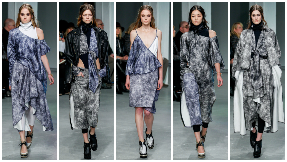
 Mottled? Dappled? Stone-washed? An artistic interpretation of a cloudy day? I'm not too sure how to accurately address this print, but I'm in love with it. It's stunning versatility and high "style success rate" is encompassed in the pictures above - be it flowy skirts, sensual knotted dresses or v-neck frocks, I want me some mysterious cloud-printed ANYTHING in my wardrobe, pronto.
 
 Black has to be the Mulleavy sisters' go-to color, because it embodies and enhances everything the brand stands for: versatility, theatrics, artistic clothing and stylistic techniques. Sure enough, the sisters did this season's black with their usual effortlessness. Sexy black leotards, plenty of slouch, heavy leathery fabrics and cloaks makes "black on black on black on black" endlessly appealing The metallic accessories were amongst the few aspects of this collection that were placed with the intention to match and blend in.

Rodarte has always struck me as a beautiful explosion of intertwined cultural references, unexpected combinations and ornate expressions of a truly artistic vision.
 
What did you think of Rodarte's Fall 2013 RTW collection?

Sunday, November 11, 2012

margiela x h&m.

I know I'm like, 10 light-years behind everyone else on the M.M.M x H&M collab hype (which seemed to have subsided a little after the cray-cray NY launch party came and went), but after ploughing through piles of homework as generous, voluminous and abundant as the fabric lavished on this particular McQueen concoction (there I go again, trying to make connections between McQueen and my life. Heh.), only now do I have the pleasure of kicking back with some Earl Grey (with milk and sugar - my new obsession!) and enjoying these beautiful designs. The intricate kimono-style patchwork was a definite winner for me, and the sharp blue number with a flourishing sleeve screamed "trendy urban bitchacho whom you should NAHT mess with," again, always a winner! I go weak at the knees for anything with a lucite heel (I'm in the midst of begging Mom for her gorgeous pair of black Prada pumps with a deliciously chunky, translucent heel), so the lush leather boots pictured in the second-to-right image have got to be on the top of my infinite wishlist; what a great way to update the stiff equestrian boot! With ingenious plays on volume, style, and even culture - this collaboration will fly off the shelves. And how, you may ask? Why, upon these particular McQueen wings of my choice, of course! (I'm on a roll with these McQueen references, aren't I).

What do you think of this collaboration? Which is your favorite piece from the images above?

Monday, October 8, 2012

lana x h&m.


It seems that Tinseltown's favourite girl has reached out her sharp claws to claim even more of the entertainment industry (is it a crime to stick fashion under the umbrella of entertainment? who knows.) - she's conquered modelling, music and movies - and now she's snagged the coveted title of H&M's AW12 face. And just when we thought Lana couldn't be soaring any higher - she's also comfortably secured her role as the face of H&M's AW13 campaign too!

This collection couldn't be more LANA. The designs are Lana, the cynical facial expressions are Lana, the colors are Lana, the hair is Lana. My favorite has to be the baby soft angora sweater in that sumptuous powdery rose hue, and in second place comes those muted floral pants, reminiscent of dark winter nights and forests and fairies and so what if I'm getting carried away because Lana's aesthetic is just so vast and full of possibilities and maybe those pants really are for fairies prancing around in the woods and night and also I love her so much okay.

 I love that this collection is so heavily influenced by her, especially since she's one of the few celebrities with a seriously strong, unshakeable aesthetic. It almost feels like H&M has finally been stamped with the vintage trademark of LDR - in other words, the line seems to represent her more than she represents the line. "A modern and feminine woman with a soft attitude" was apparently the concept of H&M's Autumn/Winter collection, and I don't see how they could've picked a better face. LDR is so incredibly versatile, and as listeners/fans, we get to see so much of who she is through what she does... without her ever saying too much. She has long nails, big hair and an even bigger voice, yet she's mysterious (and I love her for it) and really doesn't say that much in the face of the media. For some celebrities, this lack of extrovert arises as a problem, but I feel like I could be Lana's best friend because of how much I know about her solely through her music.

What do you think of Lana Del Rey's AW12 H&M collaboration? Are you excited to see her comeback during AW13 or would you prefer a change?

+ I also absolutely LOVE Lana's tattoos. I did some research and found out that she has 5 permanent ones, but she also regularly draws temporary ones for her gigs and concerts (namely various infinity signs and the words "life is beautiful" on her wrists). My favorites of her permanent tattoos are the two phrases written on the sides of each of her hands; one reads "paradise" and the other reads "trust no one." She also has the words "die young" on her ring finger, and a cursive capital "M" on her thumb, most probably signifying her grandmother named Madeleine. Lastly, she has "Nabokov Whitman" on her forearm, dedicated to Russian writer Vladimir Nabokov and poet Walt Whitman.

Tuesday, September 4, 2012

paper crown | fall 2012


{images from paper-crown.com}

I was extremely skeptical of LC's new clothing line Paper Crown when it launched it's first debut collection in Fall 2011 - I immediately brushed it off as a run-of-the-mill Kardashian stunt; a celebrity dabbling in numerous industries and succeeding merely because of their wealth/celebrity status. However, after a further look into the collection, a browse on her gorgeous website laurenconrad.com (which strikes a perfect balance between earnest fashion blogger and hairflicky celebrity) and a read of her personal wardrobe tips&tricks book entitled "Style," I quickly dismissed all the superficial impressions I had of her. She really is a hard-working young entrepreneur, and although she has the luxury of wealth and an impressive resume of star-studded experience, her work really does speak for itself - and for a 26 year old, she's succeeded tremendously in countless fields of the fashion and entertainment industries. She started off doing bits and bobs; guest-judging on ANTM Cycle 13, being named the first official spokesperson of beauty brand mark., doing cameo appearances on popular sitcoms, and landing a role on MTV's hit series The Hills. Clearly the decision of only a prudent, business-savvy individual, Lauren took a break from most of the aforementioned projects such as representing other brands, and armed with her extensive experience, she began one of her own. 

To start off with, Paper Crown is just such a perfect name, I can't get over how many wonderful connotations it has. It's not trashy, excessive teen royalty a la Juicy Couture, nor is it literal royalty for the refined, pantsuit-donning millionaire mama. It's a crown made of paper; it's almost a juvenile perception and interpretation of the elite few that the fashion industry seems to constantly strive to impress. It almost feels like child's play - an endless exploration of fashion, dimension, design, color and aesthetic. It's a wonderfully dynamic yet sugary-sweet concept, and it reminds me very much of one of my favorite Taylor Swift songs: "Long Live." 
 ~
"We are the kings and the queens, you traded your baseball cap for a crown."

"I had the time of my life fighting dragons with you."

"Cause for a moment a band of thieves in ripped up jeans got to rule the world."
 ~
(full lyrics here - please read/listen to the song if you haven't already done so, you seriously won't regret it!)

Okay so I got a little carried away; it's really only the first song lyric (bolded) that is relevant to the whole "crown" theme, but the whole song is full of nostalgia for younger days - when everything seemed conquerable and manageable and life was so full of restlessness and sheer moments of victory, however small. The same theme of childlike innocence and sense of infinite success and capability is reflected in Paper Crown's gorgeous Fall 2012 collection; the vast range of styles and trends reflected in so few looks is truly mind-blowing. From voluminous dresses to everyday shifts smothered in pretty bows, this collection expertly retains a playful sense of childhood and relaxation while maintaining a high street appeal, thanks to the versatile, million-dollar color scheme (brick red, muted mocha and light cream, definitely a yes). As well as having a cosy, homewear side to it (think Zara/H&M basics), the collection definitely proves compatible with a chic city-hopper too; the shift dresses and floral button-downs are very Marks and Sparks!

Yeah, and we thought Lauren Conrad's reign would end after The Hills drew to a close. Apparently she's only just found her crowning glory.